Thursday, 3 December 2015

'Three peaks and a domed house' patterns revisited in gold and silver.


Here they are. These are 3 peaks and a house patterns revisited in gold and silver from August 2011.

The target on silver was $12.44 and on gold it was $1155. As you can see, silver had already made its top near $50 at point Z and was on its way down into the $30-40 range when I annotated the chart. Now it is $14:


Gold has of course already exceeded its $1155 target to the downside as of the end of 2014 and is now at $1060 as of late 2015. Again, this chart was made in August 2011. The breakout happened much later in gold and was much shorter in duration. It was only another month or less to the gold top price of $1920 when this chart was drawn:


Friday, 27 November 2015

Re-visiting old chart with gold target of $780.

I never posted my gold bear market chart with the $780 target, so here it is. I cannot update this because I no longer use this particular charting service.

I regarded the $730 high in 2006, the $1030 high in 2008 and especially the $680 low in late 2008 as key points to try to draw median lines of some kind. I noticed a pattern where the impulsive move up to $1920 is a larger version of the impulsive move to $1030 from 2008. On the score there is a possible target of $780 for gold, depending on the time-frame since the target line is sloping.

My estimate for this low was perhaps in 2015 and here we are. This chart was drawn in early 2014:


Wednesday, 11 November 2015

Breakout from long term US dollar bear market since 1971?

I have asked Rick Ackerman on www.kereport.com blog what he thinks about the possible reversal of the generational downtrend in the US dollar.

For 45 years, we have had typical US dollar bull and bear market cycles:

8 years down 1971-1979
6 years up 1979-1985
7 years down 1985-1992
9 years up 1992-2001
7 years down 2001-2008
9 years up? 2008-2017?

That is about an average 8 year bull and bear cycle.

In this interview,

It sounds like Rick is forecasting that the last 45 years action in the US dollar with lower lows in every cycle is not going to be followed and the normal cycle is going to break.

In that case, it seems that it might be more likely to break to the upside if he says the up-cycle will continue for another 5 years, that gives a dollar top in 2020 and a 12 year bull market in the dollar!

The reason for this could be that we are in a once in a century deflation event like the one in the 1930s. So perhaps we shouldn't expect the dollar index to behave as it has in the past 45 years because they are irrelevant to the current events

This has all kinds of implications:

One might be that the dollar could have turned up into a secular generational bull market in a break from the past 45 years of its making lower lows.

It also would imply secular bear market in the Euro contrary to European currency strength versus the USD in recent decades. Perhaps it would go hand in hand with disintegration of the Euro and the European Union whose integration was coincident with its generational bull market ending in 2008.

It could also imply deflation and a long period of it, not atypical in a credit contraction after an exceptional financial bubble.

That might put an end also to the commodities cycles that tend to run inverse to the US dollar, so perhaps the commodities bear market has further to run and looking at recent lows like the 2008 lows or 2001 lows in commodities as a guide is irrelevant.

It might also imply that there will be no continuation of a secular gold bull market perhaps for many years but perhaps some kind of trading range at relatively subdued levels for many years.


Saturday, 31 October 2015

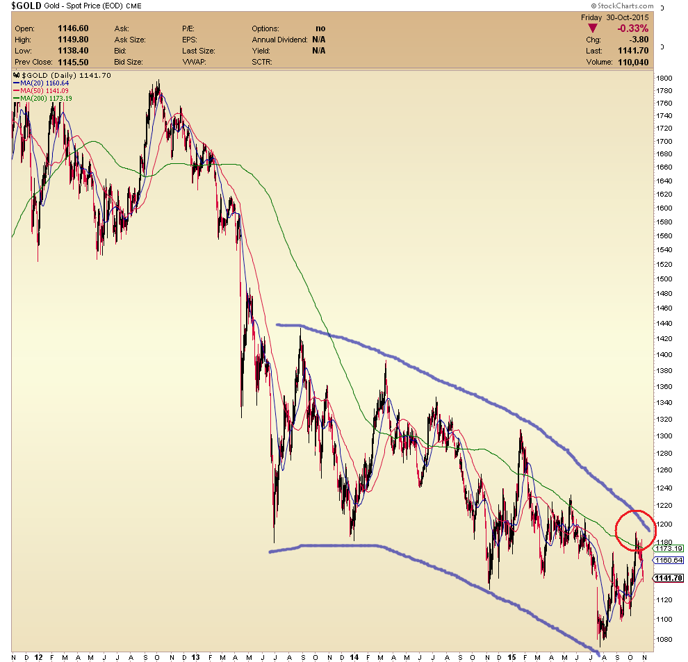
Bearish curves on gold chart from last 2+ years

Looking at this weekend gold chart, I noticed that there are bearish curves on gold chart from last 2 years. Ol' Jim Sinclair used to say about 10 years ago that one should have a set of parallel rulers and some French curves to do charting.

Instead of drawing a falling wedge, one might instead encompass the last 2.5 years of price action between two steepening down curves.


Well, here are some curves on the gold chart that do not look too good.

In sketch form, if the recent high circled in red is the high for this current move, then there might be a lot more downside to come. This recent up cycle looks a lot like a stunted version of the previous up cycle from January 2015:


Looking from an even more bearish perspective, this last 2+ years of action mirrors the action in late 2012 to early 2013. We are again at the 4th high of a series of falling highs. Last time, the 4th high was the failure to hold above $1600. This one is the failure to get to $1200. Geronimo?

I am beginning to realize that you can draw almost anything on one of these charts but I do not like at all the downside acceleration of both the highs and the lows. It is ongoing as far as I can see. Who knows when it will end?


The 2012-2013 down move culminated oi the mid-April crash in gold on 12 and 15 April 2013. Immediately preceding the crash there was a failure to hold above $600 (high number 4 in purple/green on the chart) and just after that an abortive little bounce that went to about $1590, failing to reach $1600. That ushered in a $270 drop within a very short space of time.

This time around, we have the recent rally to $1190 (high number 4 in blue/red on the chart). The price failed to hold over $1180 which is key horizontal resistance dating back to the lows of June and December 2013. Very soon after we had a little bounce that failed to reach $1180. This might be an indication that gold is about to break down severely.

Here is a better chart with proper parabolas drawn for me by one of the lead contributors at http://www.goldtadise.com, which I would thoroughly recommend joining:


Last week's sharp selloff could be very bad news. Unless the price rallies to above $1180 or at least spends at least a number of weeks trading sideways, there is a chance of an imminent second crash in gold  based on this view.

However, the breakdown in April 2013 crashed through a level of support that had previously held 3 or 4 times in 2011-2013, i.e. $1520-1540. This time there is not a level of support to compare to this one. In this case, it might be postulated that the $1030 level (the highs from 2008) might be the key psychological level that may fall this time around.

To Rick’ Ackerman’s $817 target by the end of the year perhaps?

The width of the channel as measured when drawn as a falling wedge in previous posts was about $250 at the start and $170 recently. The $250 is about equal to the original April 2013 crash down move ($-270 from $1590 to $1320) so perhaps I could propose the secondary down move might be of the order of $170 from wherever the bottom of the channel is currently. It is not far above $1000 on the curved channel above and a little higher is you draw it as a straight falling wedge (maybe (1050?). It also depends on the time taken for the move. A down move to $1000-$170 or $830 is well within the realms of possibility.

Here are some great articles on Phase III of bear markets on goldtadise.com:

http://goldtadise.com/?p=342366, etc


Here are a couple of charts from those articles (these do not belong to me but they do not show on the above articles at the moment for some reason.) Note the striking similarity between the down-move in the Dow in 1929-32 and gold in 2012-2015. Both bear markets had their middle stage within an inverted parabolic trading channel. In the case of the Dow in 1932, the final plunge was still within that trading channel but this still allowed for a huge drop to the final low. I suspect the same may happen with gold. At present, the channel bottom is at $1000 but I think that will probably match the action in the Dow at the start of 1932 - a sideways to up shallow bounce to follow plus a plunge to $800. I therefore think the recent $1191 high in gold was probably equivalent to the Dow high in Nov 1932 (or perhaps the one in March 1932 if one is to be a little more optimistic). 


Here are a couple of links:

http://rambus1.com/2015/10/31/late-friday-night-charts-28/
BOO!

http://traderdan.com/?p=7722
BOO times TWO!

There was an interesting show on Korelin Economics Report this weekend from the New Orleans Investment Conference:

http://www.kereport.com/2015/10/31/2015-orleans-investment-conference/

This post is mirrored on Golf TA Paradise at 

http://goldtadise.com/?p=355165
"Bearish curves on gold chart from last 2+ years"

with some good user comments underneath.


Tuesday, 13 October 2015

Gold breaks out of small falling wedge formation but larger one remains intact.

Gold breaks out of small (9 month) falling wedge formation but larger one 
(2-year+) remains intact:


$1240 would be needed to break out of the larger wedge even by a tiny bit; perhaps one should say $1250 would be needed to make any kind of convincing move out of the wedge to the upside.

Monday, 5 October 2015

Modified appropriated chart from Cory's blog post... 2015-10-05.

Here is a modified version of Cory's chart from his Korelin Economics Report blog post at:

http://www.kereport.com/2015/10/05/gold-verge-breakout-higher-etf-holdings-rise/

To me, the chart looks like bear flag city already. Nothing has changed: