Wednesday 16 October 2013

S&P 500 hits expected resistance at 1709-1720 at top of downtrend pitchfork and possible pennant 2013-10-17

Thre S&P 500 has hit expected resistance at 1709-1720, actually it popped up to 1720 on the 16th of October to hit the top of the possible downtrend pitchfork and possible pennant. 
 
 
So what now? Something like this?
 
 
I drew the first downmove too steep so that it would reach the downsloping parallel, which is probably too low anyway. But it is just a whimsical notion.
 
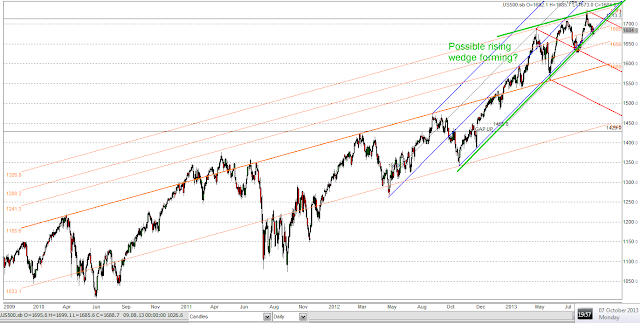
The longer term chart shows that all of the uptrends are still intact and marks the pennant:
 

If the S&P is reversed to the downsidefrom this owntrend pitchfok is in action  level, it could mark the point where a pennant is forming and the proposed red downtrend pitchfok is now coming into play There could then be a fight between the bulls and bears: between the long term blue uptrend channel whose support has been slipping a little and this new downtrend slope. I saw this downtrend first described in a coghlancapital free webinar and on the market calls section of his excellent website.

Currently, the very long term (4 year) uptrend marked in orange has shown no slippage - the price bounced twice recently on one of the orange parallels that you can note was previously resistance, just before the first of the recent major highs was made. In fact, that parallel forms the lower line of the green pennant that may be coming in. This parallel is also delineated by a major price high over 2.5 years ago and should therefore be strong support. The parallel beneath it goes back 3 years and has clearly gone from resistance to support over the last year or so.

I love charts! :-)

Gold Point and Figure chart points at possible larget bear pennant and strong resistance 2013-10-17

The Gold Point and Figure chart points at possible large bear pennant and also shows a very strong resistance line that has, as I have mentioned capped the price for 2 months.


Note that we had a rally in the last few days that fell short of resistance line that has held the price for the last 2 months. Actually, we had an intraday move down to $1250 and a move back up intrday to the low 1280s since. However,this is a sign of slippage in the price and is bearish because it may show the start of downside acceleration of the price of gold.

Also, on the candlestick charts, there is slippage every week or so as the uptrend tries to re-assert itself and fails into a downtrend. Support along these lines is always becoming resistance. Also, you can see hints of acceleration of the downtrend, though it has yet to go to the floor of the downtrend channel, which is now below the bottom of this chart:


Monday 14 October 2013

Nikkei broken out and tested bullish wedge? 2013-10-15

The Nikkei 225 in Japan appears to have broken out of what looks like a bullish wedge pattern for the last few months:


Now the action in the Nikkei in the last 3 years has generally followed the US dollar : Yen rate. In this instanc,e the rate is rising as expected, implying a stronger dollar - and this has usually been BEARISH FOR GOLD!

Gold and silver at key points on bearish heads and shoulders formations 2013-10-15 0251 BST

Well, there has been some further progress in the bearish case for gold and silver last Friday and this Monday.

I have already noted the head and shoulders formations in gold and silver:

http://1000gold.blogspot.co.uk/2013/10/head-and-shoulders-in-silver-hits.html

http://1000gold.blogspot.co.uk/2013/10/more-deterioration-in-gold-chart-and.html

The silver chart has not moved much on Monday but is basically a tiny fraction (about 20 cents) above the neckline of the head and shoulders. The potential target for a downmove is a $15.59 silver price. The only redeeming feature is that the neckline is prior support but then these necklines are always prior support!. We need a bounce at this support just below $21.00, otherwise it is look out below!:


The gold chart also has a nasty head and shoulders. Two possible necklines. The first (small dots) has already broken down. The second (heavier dashes) has breached to the downside and back-tested as I write on the Monday rise and capping of the price at around $1290. The target is $1117:


This would give the gold:silver ratio increasing to a target of 71.6 and the expected underperformance of silver relative to gold on a price smash.

Note the multiple failues in gold to hold onto any kind of uptrend slope, with support becoming resistance on many occasions. Also, gold is threatening to breach 1272 horizontal support from over 2 months ago:


Wedge formations on recent rallies in S&P500 2013-10-15

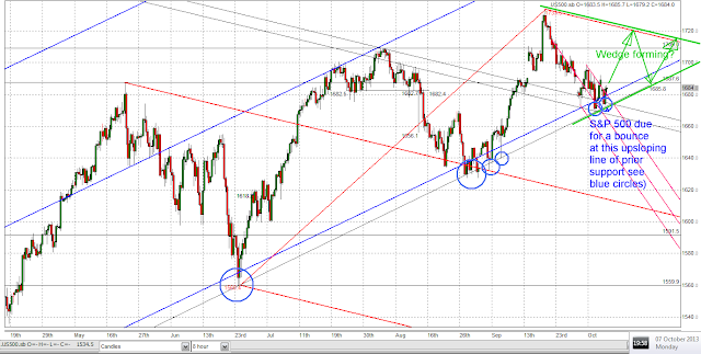
Here are two wedge formations on the S&P500 chart. One might be bullish, the other, larger one might be bearish.

It will be instructive if the price action unfolds as on the first chart and the S&P tops at a lower high, because the large red downtrend pitchfork might come into play, at least for a short while. As of the construction of this chart, the S&P was at prior support and due for a bounce!:


However, there is a larger pattern, a rising wedge, which would allow for another new all-time high. In the end, rising wedges are often, though not always bearish:
 

Since I did these charts, the S&P500 has had a sharp rally, because it was due for a bounce. Did it get past 1709 to stay with thin the first wedge and the red pitchfork? Well, 1711 is not conclusive yet, because 1709 was my target just by estimation. It's close, so see if it moves up or down from here. If the market continues up, it would have to top near to 1750 to stay within the larger rising wedge.

Saturday 12 October 2013

Could the Dow:Gold ratio go close to zero? 2013-10-13

The answer is NOT RIGHT NOW! However, this article is looking much further out, maybe 5 to 10 years, perhaps?

Imagine if hyperinflation happens in the US and/or other countries.

Does the stock market go up a lot in nominal terms? [Yes].
Does the stock market keep up with gold? [No.]
Does the stock market protect your wealth? [No.]

For explanation, please see below:

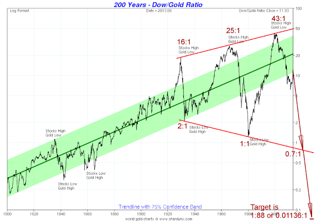
The Dow: gold ratio has varied from 43:1 to 1:1 in the last 85 years but has become increasingly unstable and has made a huge megaphone pattern. I suggested that this megaphone was an indication and a consequence of the increasing confusion of price and value under a fiat monetary system since the Federal Reserve was created in 1913-1914. The instability began in the 1920s and the first overshoot forming the first peak of the megaphone pattern happened at the stock market peak in 1929.


The previous history of the Dow:gold ratio on the Gold Standard (or bimetallism with gold and silver money) in the period 1800-1913 was in a gentle uptrend with various recessions and 'panics' which caused relatively modest fluctuations compared with those in the 20th Century under varioous bastardisations of the gold standard and irredeemable fiat monetary systems.

I suggested that the pattern looks like a positive feedback oscillation which would catastophically fail as the Tacoma Narrows bridge failed in its resonant oscillation some decades ago.

In 2008, I suggested that a breakdown of the megaphone pattern, which could occur if Dow:Gold went below about 0.7 might lead on a log chart to a ratio of 1:88 (or 0.01136:1). That would be on a measured move of a factor of 61 (43/0.7) equal to the difference between the 43 intersection of the upper line and the 0.7 intersection of the lower line. 0.7/61 is about 1/88th.)

It seems outrageous that an ounce of gold might be worth 88 units of the Dow Jones Industrial Average but I postulated that it might occur in a hyperinflation.

Well I have succeeded in getting some stock market figures for the German Weimar hyperinflation, comparing the currency value and price of gold with the stock market index in Germany for 1914 and November 1923, the latter date when the hyperinflation reached its peak.

The stocks:gold price ratio went from 1.448 to 0.0000003091. Yes, that's right, from 1.4 in 1914 to 3 times 10 to the power of minus seven in November 1923!

 Year     German stock market      Gold price in Reichsmarks        Ratio
1914                 126                                   87                          1.448
1923           26,890,000                  87,000,000,000,000       0.0000003091

I obtained the German stock market figures from a fascinating timeline at :
http://www.nowandfutures.com/us_weimar.html

So basically, the stock market:gold ratio went to zero for all intents and purposes, even though the stock market went up by a factor of 212,000x.

Unfortunately, the currency fell by a factor of 1 trillion against the dollar and therefore by a factor of 1 trillion against gold, since gold was fixed against the US dollar at $20.67 per ounce (the Mark went from 4.2 to the dollar to 4.2 trillion to the dollar). The change in the stocks:gold ration was a factor of about 4.6 million, i.e. gold moved up 4.6 million times as much as German stocks!

So under a US dollar hyperinflation, my target of 0.01136:1 for the Dow:gold ratio could be very conservative!

[Chart courtesy of Nick Laird of www.Sharelynx.com, to whom I wrote for permission to use it in 2008 and received a positive reply. Thanks Nick for a great website.]

My previous articles on this topic are here:

http://1000gold.blogspot.co.uk/2008/06/mega-move-from-dowgold-megaphone-2008.html

http://1000gold.blogspot.co.uk/2008/06/megaphone-top-in-dowgold-ratio-2008-06.html

http://1000gold.blogspot.co.uk/2008/04/chart-hints-at-financial-disintegration.html

Happy reading!


Head and shoulders in silver hits the neckline. 2013-10-13

The Head and Shoulders in silver has hit the necklline. now, will it break down or will it bounce from the neckline, where it has previously found support?

Bob Hoye says the sector is very oversold. I have noticed also that the GDX, GDXJ, HUI and XAU have all made lower lows and have broken the higher highs and higher lows of the recent rally. All bearish action. Gold's head and shoulders is breaking down, especially since Fridays downside action and silver's looks like this:


A breakdown from the neckline, currenly at $21 and a measure move of $25.12-$19.85 = $5.27 (the height of the head and shoulders) would give a target of $15.73 for silver.

I already wrote that the target for the head and shoulders in gold could be about $1180, the same as the 28th June low.

Looking at the silver chart, there have been 4 bounces along the red line and a couple a little above it early on in this rally. The price did bonce on Friday and did not end at the low so it is a slightly hammer shaped candle, though not a convincing hammer candle. We need to see what happens over the next couple of trading days early in this next week to get an idea of whether we have an overslld bounce or whether we are going to get a H&S breakdown to take this bear market to new lows.

It's interesting but gold and silver both have shallo uptrend channels from the 28 June lows that have multiple supports a long the channel floor (like the red line above) if you ignore the domed move in the middle which was a breakout from the channel and a move back into it. That might mean that we might not get head and shoulders breakdowns but just a shallow and gradual uptrend (which accelerated too quickly in August and has not returned to a more 'sensible' uptrend.)

s

Wednesday 9 October 2013

More deterioration in gold chart and dollar then starts to rally 203-10-10 0357 BST.

The gold chart is looking quite poorly as of now and just at the most inconvenient moment for gold bulls the US dollar starts to rally.

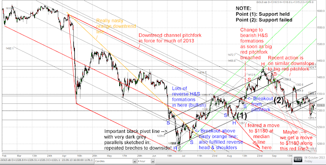
Note the thick upsloping black key pivot line on the chart below, where gold's behaviour changed from having bullish reverse heads and shoulder to bearish heads and shoulders.

The blue line parallel to this was support that held on the August correction at point (1) but gave away in this correction at point (2). Clearly the uptrend was broken there. Worse is that there was a backtest of this blue line and it became resistance:

 
As I mentioned, there was a backtest of this blue line and it became resistance. Live chart as of 04:00 today Support became resistance at point (3):
 
 
Almost the entire uptrend recover rally in gold is now looking like a large bearish head and shoulders formation:
 
 
and the entire recovery rally in silver could also be making a large bearish head and shoulders formation:


Monday 7 October 2013

Head and shoulders in gold and gold at Point and Figure strong resistance. Posted 2013-10-07 1808 BST

Bearish Head and shoulders in gold with the head at $1434, target is about $1180, same as the 28th June low:


Gold at Point and Figure strong resistanc., courtesy of stockcharts.com free charting gallery Vew which is an excellent service:

http://stockcharts.com/freecharts/gallery.html?s=%24GOLD

As I commented on kereport.com just now:

It’s THE THIN RED LINE (or maybe the thick red line).
Point and Figure chart (very old fashioned, traditional type). Point at it and then go figure!
It shows the top at $1800 in September 2012 and the subsequent bear market in gold.


The price is now completely capped by a 45 degree downtrend line and has been since lkast August 2013 (about 5-6 weeks) since price had a high at $1434. Gold is so clearly AT KEY RESISTACE on thisa line and the level or the resistance is falling.
Either it’s going down or it’s going up, folks! ;-)

I would think that to break out above this line would be VERY BULLISH, if it happens. Of course, it has to happen sometime because eventually this line will cross zero.

$1330 is needed to breach the line, $1340 to break above it.


Charting maniac! Some charts of the recent action in gold since August 2013. Posted 2013-10-07

OK, I am going to add a chart here and add some more later if my computer and blogger will let me.

Here is the main one for the weekend just gone. There are some nasty head and shoulders patterns. You may notice a bigger H&S that I have not marked here. It will be on the next posting: