
Wednesday 31 July 2013
Pennant rescue team comes in near to close of trading for July : 2013-07-31 23:44 BST
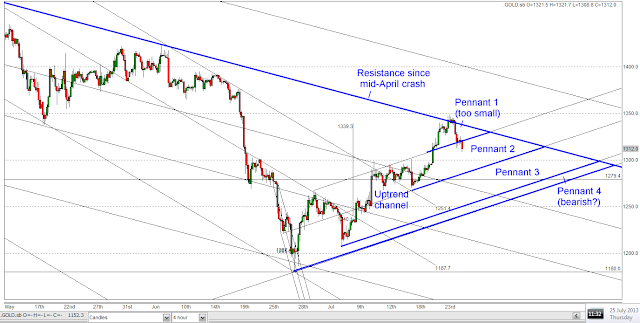
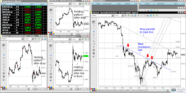
The Pennant Rescue Team has come in near to close of trading for July and reversed most of the pennant breakdown. However, a short term downtrend channel has also formed that is parallel to the longer term downtrend in force since the mid-April crash. The bulls have shown some spirit, bringing the price just back into the apex region of the pennant:

Pennant in gold foiled again! Swiss Stairs forming? - 2013-07-31 18:59 BST
The bullish pennant in gold has failed like the first one did, almost exactly the same but not quite.

Both had strong resistance lines to overcome so maybe it is not too surprising. The downside target must be not far from $1300, which is where there should be some support, which was resistance in early July and also right back to late June, as the two horizontal lines on the chart above indicate.
What now?
Rick Ackerman's comments on www.kereport.com today were that smart money may be accumulating gold and cautiosly not letting prices rise too fast as they do so, presumably stepping back from buying on any breakouts.
That might mean that we are getting Jim Sinclair's famous "Swiss Stairs" formation and perhaps, if we are optimistic, we can already see 3 stairs formed on the daily chart as of now.
I wrote a little piece a long time ago in 2009 showing a Swiss Stairs formation in gold from that year, following the bounce from the late 2008 low. I hope you don't mind my sharing it with you.http://1000gold.blogspot.co.uk/2009/11/jim-sinclairs-swiss-stairs-in-gold-2009.html
Jim Sinclair always said this formation was the smart buying coming into a market, presumably in good size but carefully. Accumulation and mark up:

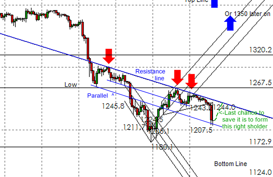
Progress with bullish pennant in gold? Not much! 2013-07-31.
There has not been much positive progress with the bullish pennant in gold as of late 30th July 2013. The charts says it all:


Honourable mention on the Korelin Economics Report! -:) 2013-07-31
I post comments on the www.kereport.com website with reasonable frequency, as Silverbug Dave, though I am not really a silverbug, at least not now!
Anyway, I was surpsied to read yesterday an entry where Al Korelin and COry Fleck discussed my post that I put on as a response to their weekend show, which was a really good show, by the way. It often is.
http://www.kereport.com/2013/07/27/great-table-discussions/
My coment related to the policies of the interventionist economcists, central bankers and governments and James Dines' comment from a couple of years ago that all these people would be defeated paradox and irony.
"On July 27, 2013 at 4:17 am,
Silverbug Dave says:
Monday 29 July 2013
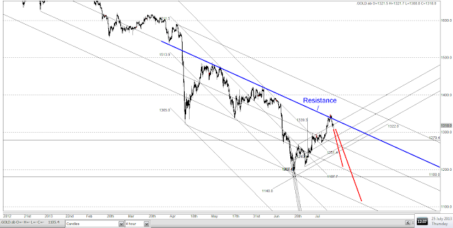
Pennant update: resistance lines shown and possible breakout coming hopefully? - 2013-07-28
I updated my chart drawn on Saturday to show the resistance lines that accompanied the bullish pennants during the current gold rally. Both pennants had quite important coincident resistance lines to overcome:

As I mentioned previously, the firsrt pennant back in early July (the red one) failed before repairing and forming a bigger right shoulder for an inverse head and shoulders with the necking along the red resistance line. Resistance was then beroktn to the upside and there was a stong upmove to the target of the head and shoulders which went to $1339.
Now gold ins in a similar pattern. A pennant forming at resistance lineshown in blue that also encompasses two important recent highs (to upper left of the chart).
This time however, the resistance is already pushed bak by the new blue pennant - the highs have broken through the resistance a bit. If one were to be more liberal in interpreting the resistance line, it might be drawn a little lower and the pennant wold already be breaking throught more. Anyway, it is a nice construction.
As I write, there is a third move (that started last Friday late in the session - see chart above) that is now bresking the resistance line and has reached $1330. It looks like a potential breakout from the pattern.
Remember that the resistance line has capped both previous rallies since the April crash so a failure there would be very bearish, indicating a possible move to new lows or at least to an intermediate low not far above $1200.
A convincing breakout of the pennant would put targets of $1414 (from the pennant) and $1421 (from the current inverse H&S) in the frame as mentioned in the last post. Both these targets are also above the top of the downtrend channel that comes from the start of the April crash and could constitute a breakout from this damaging downtrend. See charts below:

Right now, the price has moved above the upper line of the pennat and has come to test the upper line as support. More strictly it is testing the resistance line from the previous rally highs as supprt because it penetrated the pennant line slightly:

Looking back at the last post, I was a little too liberal with my targets. I should have taken the top of the pannant at $1348 and not $1356, so the pennant target is more like near to $1408, not $1414.
What I would not like to see is the price sliding down the upper line of the pennant because, when that occurs, I have seen pennants fail, possibly because the bullish impulse to breakout is fading and then gets overwhelmed. A decisive breakout is needed, soon.
Saturday 27 July 2013
Bullish pennant forming again in gold Inverse H&S breakout - $1300 level key support - 2013-07-27
Gold has formed a bullish pennant as forecast in an earlier post. The pennant has its low at $1300 when the price moved up aggressively over resistance that had held for a while.
The pennant is shown in blue and is working nicely right now as of Friday's close. I also spotted just now an inverse head and shoulders with neckline at around $1300 and this has already broken out to the upside:
 So what are the targets for these?
Pennant:
Measured move:
1356-1297.6=58.40
Target:
1356+58.4=1414.40
Inverse Head & Shoulders:
Measured move:
1300.70-1180.0=120.70
Target:
1300.70+120.7=1421.40
This is fascinating, because this would take the price close to the quadruple top resistance from the end of 2010 at and below $1430, where the market rolled over (and maybe there was distribultion) before the big move to $1920. There is also resistance at about $1421 from the last rally top in late May, so there is strong resistance near my rally target. It seems a natural stop off point.
I think that $1430 and $1530 (where there was previously support from late 2011 to April 2012) will be the big obstacles for gold's current recovery rally.
I am potentially liking the current chart for a move to $1410-1420, contingent on this pennant's not breaking down like the last one did (see red pennant on chart),
[There was a 'false' breakdown from the red pennant, which was later repaired. Interestingly that pennant was also linked to a sloping inverse head and shoulders that had its neckline along the upper line of the pennant in that case The target for this first, sloping inverse H&S was $1339.30 and gold has already reached that far.]
The pennant is shown in blue and is working nicely right now as of Friday's close. I also spotted just now an inverse head and shoulders with neckline at around $1300 and this has already broken out to the upside:

Pennant:
Measured move:
1356-1297.6=58.40
Target:
1356+58.4=1414.40
Inverse Head & Shoulders:
Measured move:
1300.70-1180.0=120.70
Target:
1300.70+120.7=1421.40
This is fascinating, because this would take the price close to the quadruple top resistance from the end of 2010 at and below $1430, where the market rolled over (and maybe there was distribultion) before the big move to $1920. There is also resistance at about $1421 from the last rally top in late May, so there is strong resistance near my rally target. It seems a natural stop off point.
I think that $1430 and $1530 (where there was previously support from late 2011 to April 2012) will be the big obstacles for gold's current recovery rally.
I am potentially liking the current chart for a move to $1410-1420, contingent on this pennant's not breaking down like the last one did (see red pennant on chart),
[There was a 'false' breakdown from the red pennant, which was later repaired. Interestingly that pennant was also linked to a sloping inverse head and shoulders that had its neckline along the upper line of the pennant in that case The target for this first, sloping inverse H&S was $1339.30 and gold has already reached that far.]
Thursday 25 July 2013
Long Term Gold Chart 1968-2013 and Fibonacci targets abound - correction of ENTIRE BULL MARKET move.
I was looking for my blog post that had these on but it has disappeared! So I am going to re-post it here:
One remark at the outset is that Fibonacci numbers and the Golden Ratio appears all over the gold action from the years 1968 until 2013 - quite appropriate, don't you think?
One remark at the outset is that Fibonacci numbers and the Golden Ratio appears all over the gold action from the years 1968 until 2013 - quite appropriate, don't you think?
This was my long term gold chart 1968-2013 constructed from Kitco daily London Fix data (early 1970s uses monthly averages - all that was available). I modified it a few times to include the ever-increasing black candlesticks for the 2013 price! Here is the chart for when gold had got down to the 38.2% retracement of the entire bull market:

Next up is my trading screen chart showing almost identical Fibonacci retracement targets. Note that this chart was taken on the day of the 28th June low (the price was $1193 at the moment I took the screenshot). This chart covers the period 1994-2013:
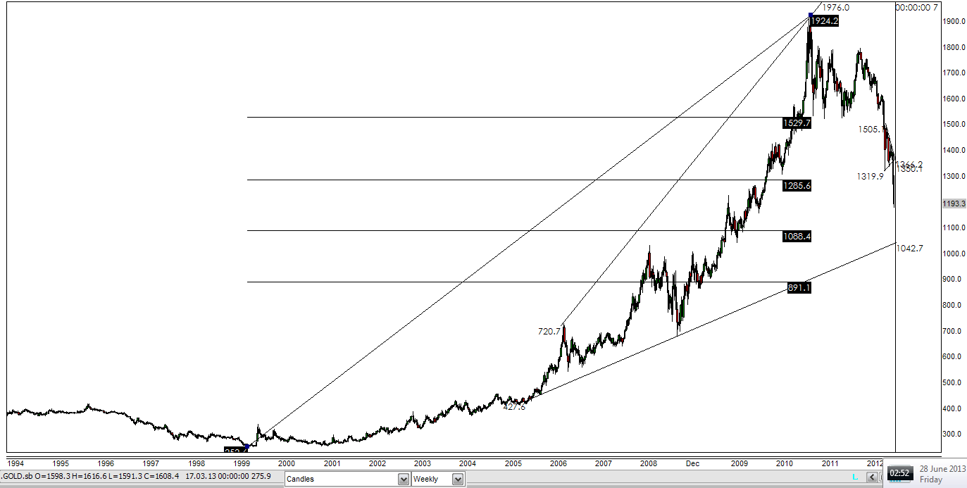
The 38.2% retracement target has been exceeded and the price low still in force today (25 July 2013) is $1180, midway from the 38.2% to 50% targets.
I am still looking out for any formation that could lead price to $1087 or $890, which are the 50% and 61.8% retracements.
Look how the 61.8% correction takes gold back to the exact 1980 gold futures high at $890 from 21 January 1980! Amazing! In that case, the upside at the price peak at $1920 was 1.618 times the downside to the $252 low in 1999. The top at $1920 should therefore have been predictable as a possible important top, a very important one.
Something interesting to note from the second chart is that the 23.6% retracement target was $1529! That is where the major support appeared that was held three times in 2011-2012 and which finally broke down on the mid-April 2013 crash! I had not noticed that before this very moment - I rarely look at the 23.8% Fibonacci target - maybe I had better start!
I fail to understand why many chart technicians still insist on using retracement targets measured from the 2008 low or any other arbitrary point. They have not removed the scales from their eyes. This correction is a correction of the ENTIRE BULL MARKET MOVE, guys! They should have seen that many weeks ago. And
many of these people charge you money for their 'services'?
Possible pennant to form? Oops, as I write, the market is falling, so it's way ahead of me!
I was going to write the following:
Gold has broken above its recent uptrend channel and has met an upside objective of $1139 from the bullish reverse head and shoulders centred on the low of 28th June.
It was then standing at important resistance that has capped the price since mid-April.

1. Bullish case:
How about gold takes a breather here and forms a bullish pennant between the falling resistance line and the rising uptrend line?
2. Bearish case:
Maybe the price will be capped at the resistance line as it has been twice beroe and the relief rally is over. Look out for a move down.
3. Ultra-bullish goldbug case: Gold will rocket through the resistance line and it's a new bull market.
I looked at option (1) as the most likely, followed by option (2).
If a pennant were to formas in the chart above, the downside would be $1318. That would be a tight pennent but of course, the price could fall back into the little uptrend channel and form a larger pennant.
Reality:
HA! Gold has taken a bit of a dive thie morning to $1310 (so far). So the above pennant is blown out of the water. However, the centre line of my uptrend is at about $1286 right now so a fall to $1286 wouldn't be a disaster. To hit the bottom of the uptrend channel would take gold to $1240 or $1250. Any pennat forming then might be a bearish pennant! So we are not out of the woods yet.
Let's see if $1300 holds first, then $1286 before getting too excited.

Let's have a look at perspective.
Bullish price needed to get out of April crash more is $1350-1360: that could be the target of a bullish pennant if it occurs:

Bearish targets if this thing breaks down as it has done twice before:
$1200 and $1100:

Tuesday 23 July 2013
Gold trying to push through after small pullback - 2013-07-23
Gold is at or just above the resistance parallel that I mentioned last night and has actuallu now passed where it was on last night's chart within the blue circle and has crossed the line to the upside. Note that this line has been in play in trading since last December. It needs to become support for the bullish case to be valid. See blue circles below.
Last night's view:

Today's view. Note that the price has broken out of the top of the small bullish pitchfork trand channel that has been in force and goes off the right hand side of the chart:

and again - the price is pulling back right to the line:

Last night's view:

Today's view. Note that the price has broken out of the top of the small bullish pitchfork trand channel that has been in force and goes off the right hand side of the chart:

and again - the price is pulling back right to the line:

Monday 22 July 2013
Important rally for gold on Monday 22 July: Written 2013-07-23
Gold made an important jump through $1300 on Monday at the Asian open and then followed through with an impressive performance to get to about $1340 by the COMEX close in NYC.
Now for a basic chart.
The pitchfork in force since April (actually with price points as far back as last December is still in force, so the price is still fighting the medium term downtrend. The two steep lines starting in April seem to have been broken well to the upside. The lower of these was formidable resistance in early July:

Now for a basic chart. Points to watch are given below:
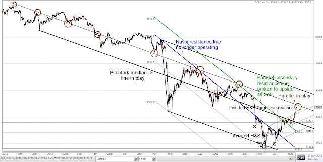
1. The nasty blue resistance line seems to be irrelevant now. This marked the steep downtrend that could have taken gold to $980 and even to $640.
2. The green parallel line has been broken to the upside by last week's action and especially by this Monday's action that has taken the price $40 above it.
3. The pitchfork shown on the chart in force since last December and defined by the high and low of the April crash is operating nicely. The current price is at the upper quartile of the pitchfork, the black parallel line. Note how many times gold has traded and made highs and lows that touch this line!
4. Reaching this parallel line would take gold just past the (approximate) $1339 target of the inverted Head and Shoulders centred on the $1180 low. Maybe this could be time for a small correction there as that line is reached. It has practically been reached as I write:

Friday 19 July 2013
Uncanny similarities between S&P 500 in 2013 and Silver in 2010-2011: 2013-07-20
I have noted some close similarities between S&P 500
in 2013 and Silver in 2010-2011 in terms of their trading.


It might be possible also to pull gold into this group.
1. They are all following a ‘3 peaks and a domed house’
type bullish then bearish longer term chart pattern. Gold showed this most
strongly between summer 2010 and he present day, almost completely undoing all
the gains since the pattern started at $1155. The 3 peaks to stert the pattern
in gold were actually the quadruple top that formed in late 2010. With the
S&P 500, we have 3 even more distinct peaks that formed in 2012. Silver’s
initial peaks were not as obvious but the S&P has started to follow silver
more closely in other ways.
2. I noted on this blog in July 2011 that silver and
gold’s chart patterns were similar in 2009-2011, with silver leading by up to a
year. When silver peaked in May 2011 and gold peaked in September 2011, the
time gap had narrowed to 4 months. At the time, I was looking for a possible
breakout in gold and a blow off top, which actually happened by early September
of that year. I did not fully realise at the time that the charts were in the 3
peaks and a domed house formation, that would predict crashes for both
commodities. As the silver crash materialised, I began to feel that a move to
the $300 level in gold was getting more likely and, on fully recognising the
gold chart pattern a move to $1155 was possible.
3. Present trading in the S&P 500 has now become
uncannily similar to silver’s trading across Christmas 2010 / New Year 2011.
The gold guru Jim Sinclair often said that all you need in charting is to have
a straight line ruler or a set of parallels (as used in the Navy) and to be
able to identify uptrends and power uptrends (and the corresponding downtrends).
Well, here we are!
Silver broke out in late August 2010 and entered an
extremely stable and strong uptrend, moving from about $18-$25, followed by
some increased volatility but a quick resumption of the uptrend until $31.27
was reached. The average price increase was around 10 cents per day over this
period. What followed was an almost perfect textbook 38.2% Fibonacci
retracement of the upmove, a correction taking the price to about $26.30.

What followed was a new uptrend, a power uptrend, steeper
than the previous one, with an average rate of +19 cents per day.I reckoned at
the time that silver might reach $50 by the end of May 2011Silver broke back
upwards through $31.27 and then went on with some volatility to the $49.75 top
in early May. Since then, silver crashed and the above chart clearly shows that all the gains from the uptrend and powertrend have been undone!
The S&P 500 has now done just the same. It had a
correction after peaking at about 1687 in late May 2013. The correction took
the index to around 1560 by late June. Since that low, there has been a sharp
rally to a high of 1692, which has now just surpassed the previous high. The
slope of this new power uptrend is steeper than the original uptrend, about
twice as steep, as it was for silver.

If the S&P500 follows silver, the power uptrend will
cross the original uptrend and break out of the top of it at around 1850 on the
index (as it did for silver at $40). The timing for the index reaching 1850 (the blue circle) could be around September this year, just in time for an October crash.
However, there be an additional upside blow-off move, maybe even to 2000-2500 on the index, if the price breaks out to the upside into a parabola. Then, if the S&P follows form, it could crash back down to 1039, where the 3 peaks and a domed house pattern began. A doubling, then a halving all within a year, as for silver - and similar in form to gold’s move too.
Silver's price action was not exactly the same. Looking back at the silver chart, the power uptrend took a small correction as it was crossing the first uptrend. It then took off for its parabolic accelerating move to $49.75 before crashing. Perhaps we could see another realtively small correction on the way, followed by a parabolic upside move back into the power uptrend channel.
I am going to do a bit of number crunching to see what a
feasible target could be. If tha patterns are coincident, 1850 would be a start, where the power uptrend crosses the uptrend. As I write, the price is on the median line of the main uptrend pitchfork pattern and also right at the May 2013 high, so the market is at a key level (much like silver in February 2011, when it reached $31 for the second time).
Peter Grandich on the Korelin Economics Report said here:
http://www.kereport.com/2013/07/22/peter-grandich-couple-weeks-gold-1200/
that it is possible that the conventional stock market might hold its own until Labor Day (August Bank Holiday in the UK). That would agree somewhat with the above charts, where stocks could peak in September.
Even so, there has been a slight downward correction in the Dow:Gold and S&P500:Gold ratios in the last week or so. However, in ths gold bear market, we have seen these before:
http://stockcharts.com/freecharts/gallery.html?s=%24SPX%3A%24GOLD
and
http://stockcharts.com/freecharts/gallery.html?s=%24SPX%3A%24GOLD
The spanner in the works is if the S&P500 and Dow make double tops here right now. They have so far been lacklustre in passing their previous highs, unlike silver when it passed $31 in February 2011.
Monday 15 July 2013
Scary downtrend still acting on gold price but some repair seen. 2013-07-16.
This post will be shorter than the one I lost.
Here are the three charts. They are self-explanatory:
Gold is consolidating, as are the three currency charts USDX, USD:CHF and EUR:USD :

I think a move up from here would be quite promising and would show that buying pressure is accelerating with respect to selling pressure.
I have also drawn in a new pitchfork trend for 2013, similar to a previous one but the median line refers back to a low in late December 2012. Thoday's price action is right on the median line of this channel and the April and June lows are on the lower line, so I consider this to be quite a good channel. There are a coupld of other minor highs on the median line from late April and late May too. Also the mid-May low and the mid-June low are parallel to the trend.

Here are the three charts. They are self-explanatory:
Gold is consolidating, as are the three currency charts USDX, USD:CHF and EUR:USD :

The scary downtrend line defined by the blue line starting at the $1590 top in mid-April before the crash has been broken to the upside but I have drawn in a parallel that encompasses the current price high at $1300 and the late May price high.
So we can perhaps conclude that the great selling pressure starting in mid-April has not gone away, though the price is showing strength equal to the mid-May top by getting to this upper parallel. The price needs to push through this soon to illustrate to bulls that selling pressure has abated as many commentators have told us in the last week.
I am not so sure. I want evidence:

I think a move up from here would be quite promising and would show that buying pressure is accelerating with respect to selling pressure.
I have also drawn in a new pitchfork trend for 2013, similar to a previous one but the median line refers back to a low in late December 2012. Thoday's price action is right on the median line of this channel and the April and June lows are on the lower line, so I consider this to be quite a good channel. There are a coupld of other minor highs on the median line from late April and late May too. Also the mid-May low and the mid-June low are parallel to the trend.

Never trust any blog site, certainly not this one, not to lose your post! 2013-07-16
This bastard blog site just lost my post. Maybe my connection isn't too good. It was a nice post, too. Never mind. Have to post it again.
Lesson: always write the text in Word first and never write onto the blog.
Lesson: always write the text in Word first and never write onto the blog.
Sunday 14 July 2013
Last Wednesday night + Thursday morning, gold spiked and dollar fell sharply. 2013-07-14
Gold spiked to $1300 on last Wednesday night/ Thursday morning at the same time as the US dollar dropped very charply against the US dollar index basket and against the Euro and Swiss Franc as singular currency examples.

After two sharp updays for the dollar withina rising trend on 4th and 5th July and more strong action to follow, the dollar crashed from 85 to 82.5 almost instantly and wiped out all those gains.
Gold was a benificiary of this currency action and so was silver. It is well above the blue resistance line that had dogged it for the last few weeks.
Monday 8 July 2013
Gold peeks above resistance! 2013-07-08 0400 BST
Maybe it's not someting to get that excited about but gold in Asian trading has peeked above the recentl fairly unbreakable resistance line that I have noted previously (see last 2 posts):


It would be fasciating to see if it can fulfil the inverse head and shoulders now and go to Rick Ackerman's line at $1301.80 that he mentioned on www.kereport.com on Monday and pass some previous peaks - and then perhaps go on to the measured move of 1339 approximately, as shown below:

Chart patterns in gold : head and shoulders, pennant - current progress; last chance saloon. 2013-07-08 0200 BST
We had a nice little rally in gold on Monday, more or less back to the stubborn blue resistance line that I drew on charts on recent posts below.
This was my weekend chart that I didn't post due to going strawberry picking with my beat friends and their lovely kids on Saturday:

The last chance saloon was to have a rally and have a right shoulder form under the rsistance, then to break through the resistance.
So where are we as of Monday night?
Well, look below. Gold rallied almost right up to the resistance on Monday, just as I drew it above.
However, I had my pessimistic hat on, because the price did not break out above the CRUCIAL blue resistance line. I then noticed that there is another head and shoulders, marked in red, that could send the price the other way if it breaks down. See below:

This includes the downtrend channel that is delineated by the blue resistance and a parallel line starting at the April $321 bottom. Right no, that lower line stands at $980, so in the event of a quick failure of price, that is a good target to watch.
I would also consider that, if this downtrend were to continue for abother 11 weeks (it is 11 weeks old so far), the target of the bottom of the trendline (the one that goes off the bottom of the above chart) would be $980-(1321-980)= $640, somewhere near the October 2008 crash low.
This was my weekend chart that I didn't post due to going strawberry picking with my beat friends and their lovely kids on Saturday:
The last chance saloon was to have a rally and have a right shoulder form under the rsistance, then to break through the resistance.
So where are we as of Monday night?
Well, look below. Gold rallied almost right up to the resistance on Monday, just as I drew it above.
However, I had my pessimistic hat on, because the price did not break out above the CRUCIAL blue resistance line. I then noticed that there is another head and shoulders, marked in red, that could send the price the other way if it breaks down. See below:

This includes the downtrend channel that is delineated by the blue resistance and a parallel line starting at the April $321 bottom. Right no, that lower line stands at $980, so in the event of a quick failure of price, that is a good target to watch.
I would also consider that, if this downtrend were to continue for abother 11 weeks (it is 11 weeks old so far), the target of the bottom of the trendline (the one that goes off the bottom of the above chart) would be $980-(1321-980)= $640, somewhere near the October 2008 crash low.
Friday 5 July 2013
Complete failure of bullish pennant on gold - really bad news? 2013-07-05
I posted late last night saying the potential bullish pennant on gold looked vulnerable. The resistance above the pennant looked to be acting strongly and is from a line in place since the failure to get above $1590 in April before the crash.
Comments on the picture say it all: Now I am going to look and see if I have to change the downtrend pitchfork in place since 15 April and put in a steeper one, which would be very bearish and could increase the pace of the decline and extend the hyperbolic downtrend.


Comments on the picture say it all: Now I am going to look and see if I have to change the downtrend pitchfork in place since 15 April and put in a steeper one, which would be very bearish and could increase the pace of the decline and extend the hyperbolic downtrend.

Note that the blue line is a steeper downtrend than the sloping black lines that have been in force since mid-April:

Oh dear. Here could be a new downtrend to $1000:

Thursday 4 July 2013
Amazing correlation: Nikkei ratio to 2x inverse Yen fund is almost constant. 2013-07-05
I like looking at ratios sometimes especially using stockcharts.com's handy ratio feature on the charts.
For a little whilwe I have been watching the correlation of the Nikkei 225 stock market index to the Japanese Yen. Yen down means Nikkei up basically. Trash the Yen, the Nikkei flies.
OK, so I tried to find a brearish Nikkei fund. I found to my somewhat amazement that the Nikkei 225 divided by the ProShares Ultra-Short Yen fund (YCS) is very close to being a constant over the last 2 years or more.
So, why buy the Nikkei when you can just short the Yen, eh? Or vice versa? It would be fascinating to know which is better to trade!

Also, a quick look again at the Nikkei vs the Dollar:Yen exchange rate, rescaled to suit:

Nice positive correlation, except for a bump in mid-June.
Pennant in gold looks vulnerable tonight + Nikkei: are you sure it's a bear market? 2013-07-05 0300 BST
The pennant in gold looks like it might fail, though the lower line has been broken before. Gold is not strong against the blue line of resistance that is like a hardd brick wall against upward price movement in the last 3 days.
Outcome: totally unknown!
However, fascinating to watch: Dollar was up, both on the USDX and against the Swiss Franc on 4th July and Euro was down, USD trading early morning on 5th July near the high, Euro near the low:

Meanwhile, in Japan, as the Yen gets trashed versus the US dollar, the Nikkei has shown some strength:

Gold - possible bullish pennant after Friday's move and consolidation - targets 1278 and 1338? QE2 rise of gold now GONE!
The gold price is stuck beneath a fairly formidable resistance line at the moment that goes back to the $1590 top before the mid-April crash (but was temporarily broken once before). This is the sloping blue line on the chart below.
However, it has formed a bullish pennant after Friday's move up from $1180 to $1270. This formation has its apex at $1249 and could break out from about $1250 if traders chose to do so.
 The initial target might be a move equal to the depth of the pennant above the apex, which would take the price to the top line of the pitchfork channel at $1278. A more bulllish target would be a move equal to the first upmove from $1180 to $1267, taking the price to around $1338. This would also be the measured move from the inverse head and shoulders below the blue line.
I have noted that the current resistance around $1250 to $1260 is equal to the peak of gold before Quantitative Easing Round 2 (QE2) in mid-2010, which was at $1266.
This means that the inflationary effects of QE2 and QE3 have been erased as far as gold price is concerned. All gone. Same for silver, that was at about $18 at the time. I don't know if this makes the case for a price low that was set at $1180 gold and $18 ssilver last week. Maybe they could still overshoot to the downside? The 3 Peakjs and a Domed House pattern on gold has almost entirely been retraced too (target for that wass $1155).
However, it has formed a bullish pennant after Friday's move up from $1180 to $1270. This formation has its apex at $1249 and could break out from about $1250 if traders chose to do so.

I have noted that the current resistance around $1250 to $1260 is equal to the peak of gold before Quantitative Easing Round 2 (QE2) in mid-2010, which was at $1266.
This means that the inflationary effects of QE2 and QE3 have been erased as far as gold price is concerned. All gone. Same for silver, that was at about $18 at the time. I don't know if this makes the case for a price low that was set at $1180 gold and $18 ssilver last week. Maybe they could still overshoot to the downside? The 3 Peakjs and a Domed House pattern on gold has almost entirely been retraced too (target for that wass $1155).
Wednesday 3 July 2013
Reverse Head & Shoulders formed at resistance line, possible target $1346 - 2013-07-03
Rick Ackerman on Korelin Economics Report today says he sees a possible rally to $1320 area.
I similarly see a possible rally but only on a breakthrough of the key blue resistance line that has operated for most of the last 2.5 months.

There might be a new short term sideways trend channel forming:

In context, the resistance line is the sloping yellow line on this chart. The reverse Head & Shoulders is the lieelt feature to the lower right. This resistance line has been in force since April 15th (although it was broken to the upside for a little while in June). It also forms part of the bearish flag pattern that broke down, so it is an important resistance line:

Wedge city on Gold chart plus Hyperbolic Downtrend chart and Fibonacci targets - 2013-07-03
Now I have been looking at the possibility of the gold price going in to a potentially bullish falling wedge pattern starting from the downmove on April 12th/15th.
There are a couple of wedges that I drew on the chart in the previous post but I have changed this a bit to include the larger original wedge that is already acting, plus a second mlight blue and very extended wedge that might be forming. Both could take the price down further before the potential snapback which in these patterns often undoes the entire move and could send gold back to the start at $1590. The lower limit for the darker wedge is $1030 and that for the lighter wedge is $680, both key levels (the high and the low respectively from 2008).

The above chart gives an idea that, despite bullish interpretations of the rally on Friday 28 June to Monday 1 July, gold is still in a steep downtrend channel.
To give an overall perspective, we need to look at the long term chart showing the entire bull market and this correction in relation to it. A chart since 2006 is shown below.
The behaviour in the recent correction is completely different from anything that has happened in the bull market since 2001. The price is in a hyperbolic downtrend with almost constanly increasing rate. Maybe it is like the NASDAQ and Dow stock index crashes in 2000-2003 in some ways, for example the crashes in March 2001 and September 2001 in those indices. They were followed by very sharp V-bounces and then rollovers and moves to lower lows -but they were climactic type events as is this gold crash. This present correction is huge even when compared to the 2008 event and it has not yet been arrested.
The lower line on the chart is the line between the 2005 low at about $427 and the 2008 low of $680 extended to the present day, suggesting a target around $1040 if the long term uptrend is not to be broken.

Finally, a couple of charts showing Fibonacci targets.
First, my updated long term chart of gold from 1967-2013, with the move to $1280 included - of course, this needs updating again, because gold went down further to $1180!

Finally, my trading screen which has an excellent chart of the entire bull market since 1999, with almost idential levels shown on it. I cannot understand why so many technical analysts are stuck looking at fibonacci levels relating to the upmove from $680 to $1920 in 2008-2011. Can they not see that this current correction is on a larger scale than all the previous ones, in time and amount? Surely we need to consider this as a correction of the entire bull market since it started in the 1999-2001 timeframe.
Gold has already now exceeded the 38% correction level at $1285. The 50% level is at $1088 in now in play. Look and see that the 61.8% correction level goes to $891, which equals the futures market high on 21 January 1980!
The 1968-2013 chart above shows this clearly. There is an amazing Fibonacci or Golden Ratio relationship vbetween the 1980 top ($890 in April 1980 futures), the 1999 bottom ($253) and the 2011 top ($1920), with an almost perfect 1.618:1 ratio above and below the $890 level. Does this mean the $1920 was a real long term top? We have to wait and see.

Gold at Key Resistance line. Wednesday 2013-07-03.
Gold has been repelled on Tuesday at key resistance of around $1270 and has corrected to 1237.10 as I write early Wednesday morning (8am UK time). The price is actually falling out of the nice little steep uptrend channel formed since last Friday which ran from $1180 to $1270 in 2 days.

Last night, I made a chart showing the context of the current modest upmove that has been heralded as the major market turn by the bulls.
It shows the red bearish triange that broke down some days ago and the bottom at $1180 that is roughly in line with the plunge low of $1380 with respect to the downtrend. The bottom of the channel was almost hit at $1180. See below:

Now, there is also a steeper downtrend line shown in blue that comes from the start of the April crashand forms a couple of wedges. The price is trying to break out of these wedges, which might be interpreted as bullish falling wedges, perhaps. As I write, the price has fallen out of Wedge 1. The chart below shows that the price at $1242.30 was just slightly below Wedge 1 but is now at $1238.
There are 4 touches at this blue resistance line so I view it as important.
Looking again at the shorter term chart trend channel, shown below, resistance became support and has now reverted to resistance with respect to the uptrend channel, after being capped by the blue line in the longer term chart above.

Doesn't look too good right now, though this little uptrend was actually steep V-shaped bounce and a pullback might allow a more sustainable uptrend.
However, if gold re-visits the lows, wedge 2 could fail and then we could perhaps look forward to another $270 drop from the low at $1180, taking the price to $910. What the goldbugs will want is a move above the blue resiatcne line and then the wedges become bullish falling wedges with a chance of undoing the entire crash in price and sending it back to where it started at $1590.
Tuesday 2 July 2013
Pullback in gold today in recovery rally. 2013-07-02
OK, gold's rally out of the $1180 low has stalled a bit today at resistance. One would expect there to be resistance here (that was previously support at two previous lows).
Gold is trading around the green line which is a parallel to the black pitchfork formation that has delineated the trend for the last 3 months.

Another parallel has delineated the two most recent highs that are also on the upper red line of the bearish triangle (pennant) formation shown in red.
So the pitchfork still remains in force in my opinion and I am looking to see how gold behaves with respect top the existing downtrend channels shown above. It has a long way to go to get past the top of the channel, which is at $1400 at the moment but comes in at about $1350 in about a month's time.
Monday 1 July 2013
Some pitchfork gold charts aftrer a snapback rally of $80 from $1180 to $1260 on Friday and Monday - 2013-07-01
OK, now I have some Andrews pitchfork gold charts, which I have wanted to study since watching an excellent webinar on www.coghlancapital.com run by Paul Coghlan and the well-known silver trader Andrew Maguire.
This is a fascinating technical chart indicator - very simple to construct - that I created once gold had its plunge from $1590 to $1321 on Aptril 12th and 15th. This trend channel (also called median line analysis) has defined the downtrend ever since the April crash. In fact, there was some price action before April 15th that had a similar downslope (see the action at $1621.30 at the top left on the first chart).
The pitchfork channel is constructed from the top and the bottom of a move and from another high or low nearby. Inthis case, I used the top and bottom of the crash at $1590 and $1321 and a minor low at around $1560 at the upper left of the chart.
The trend channel from that midpoint is then drawn to the point midway between the high and the low and that is why it is called the median line (labelled ML on the chart).
Now let's look at the subsequent trading. Gold had a decent rally after the crash and then went up to $1480 came back down to about $1350, and then had a very minor rally forming a triangle or pennant pattern. These two highs lie on a line parallel to the downtrend that is already marked. The wonderful thing about pitchforks is that it gives equivalence to these two points, even though they are not at the same price. (Note the dip in the centre of the chart that went below $1350.)
Then we had the June plunge from about $1400 to $1260 and then a minor low. This low was in line with the previous low at $1350! People saw this as a crash but actually, the fall was only the same as the fall from the previoous $1480 high to $1350 in the middle of the chart.
Next the price bounced just a littleat around $1253 before dropping very close to the bottom line of the trend at $1179. That bottom line is important supprt and it held so far and we have had a good bounce. Where has the bounce gone? Well, it has gone to the decond sloping line from the bottom and. as you can see, this line has been support on two occasions but now serves as resistance. See second chart (blue circles).

The blue circles show the trading around the line that runs parallel to the median line but a little below it. There was a small breakout and test, followed by two bounces at this line as support, then a failure and a move down to the bottom of the channel and a good bounce back up to that line. Where did the bounce hesitate? Well, right on the line! Are we going to see resistance there and another move down to the bottom or will there be a breakout? Gold needs to have this line as support to start to build a base. It needs to get above the Top Line of this downtrend which is at about $1400 now (but in a few weeks will be at $1350) to break it to the upside. That would be the start of the repair of this market.

Now, let's take the magnifying glass to the above chart. I looked at the fall from $1300 to $1180 as it was happening and drew new Andrew pitchforks to study it. The fall was in 2 stages. I initially drew a new pitchfork when the price fell to $1270 to about $1240. However, the price quiclyk went to a lower low at about $1225 (see below), so I drew a new steeper pitchfork.

The second pitchfork (below) has quite a bit of trading along its median line early on but the price then moved above its top line quite soon. As you can then see from the above chart, the first pitchforkalso has quite a lot of trading especially along its lower line.I drew a new bottom parallel line from the low at the left of the chart. This lower line then dictated where the final low was at $1179!! From there, the price moved up quickly to the median line, traded back and forth there for a while and blew to the upside out of the trend channel, leaving it behind.
Now I am fascinated by this because it shows that indecision came into the bears who could not hold this downtrend, either on the shallower long term pitchfork or the stepper one. First, the shallow one was in play, then the steeper one, then the shallowe one. This suggests a short term turn in the market as bearish traders were exhausted.
As you can see from the chart above, the price then moved up to one of the shallow parallel lines which is in fact from the original pitchfork in place since April, which is still very much in force. Now I wonder if there will be a longer term upurn in this market or just the resumption of this larger, slightly more gradual downtrend. Note the tradin in the chart above at the top left and top right of the chart, around the shallow downtrend lines, which are from the pitchfork that dominates the trading since April 12th 2013.
To get a proper breakout, this longer term pattern has to be broken to the upside at $1350 as mentioned earlier.

Subscribe to:
Posts (Atom)
Well, the markets certainly abound with seemingly bizarre paradoxes and ironies, where the exact opposite of what should happen happens.
In Europe, the central bank prints money and bails out countries – the Euro goes up. If they don’t print money and practice sound finance, the Euro falls precipitously and everyone says their curreny is rubbish.
In the UK, we have more quantitative easing per unit of GDP than any other country (except maybe Zimbabwe; only joking) and the pound rises against the Euro.
Conclusion: in order to give your exchange rate a boost, print money!
In the USA, well, where to start? Bernanke announces QE to buy Treasury bonds and the yields go up. Then commentators say that means Bernanke and QE are failing. Straight afterwards, the yields went down to new lows. Nobody said that Bernanke is a now success. Bernanke prints money and debases the dollar. What happens? The dollar goes up! The economy starts to roll over, what happens? The stock market goes up like a rocket ship.
I thought inflation should cause interest rates to rise. The yields on bonds fall whenever the economy looks bad. So Bernanke prints money and the yields go up. Then later, they go to new lows. Bernanke needs to print money to make the yields go down further! He needs buy bonds and to cause inflation to make interest rates fall! What is going on?
The threat of deflation rallies the dollar. Everybody seems to like the dollar when the economy stinks. Bernanke needs to print money to drop the dollar and make the US more competitive. So he prints money to drop the dollar and the dollar goes up and the US economy is said to be improving!
Bernanke says he might stop QE eventually or taper it gradually. The markets crash because maybe they think the US will go bankrupt. Bernanke allows the government to take on more debt by buying their bonds even though they are bankrupt. He buys bonds that will never be paid back and everyone is happy. Unless they are on food stamps."
I was then treated to a dicussion of my posting by Al Korelin and Cory Fleck on the daily broadcast on Monday 29th July:
Insights from the Team - 9 comments